Data Visualization Graphs
In the mid section of the Dashboard, you will find two Data Visualization Graphs:
Total Messages Delivered Line Graph
Channel Distribution Pie Chart
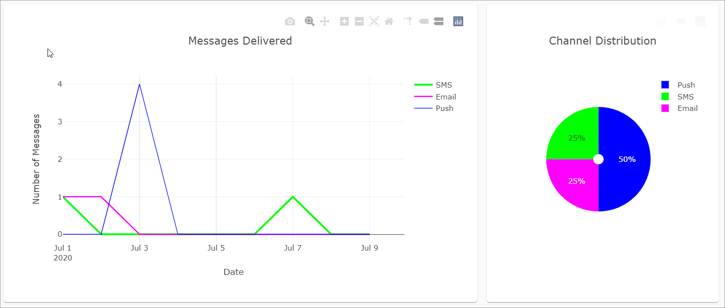
The view for each Data Visualization Graphs can be customized, as well as zoomed in or out.
To view the zoom features and other additional options, simply hover over the top right corner of the graph for the icons to appear.

These are the following designated Actions for each icon:
Download plot as a PNG
Zoom
Pan
Zoom in
Zoom out
Autoscale
Reset axes
Note
The data displayed in the Graphs are for the selected timeframe in the Date Range filter.
Total Messages Delivered Line Graph
In this Graph, find the Total Messages Delivered by the selected Date Range and Delivery Channel - SMS, Email, or Push.
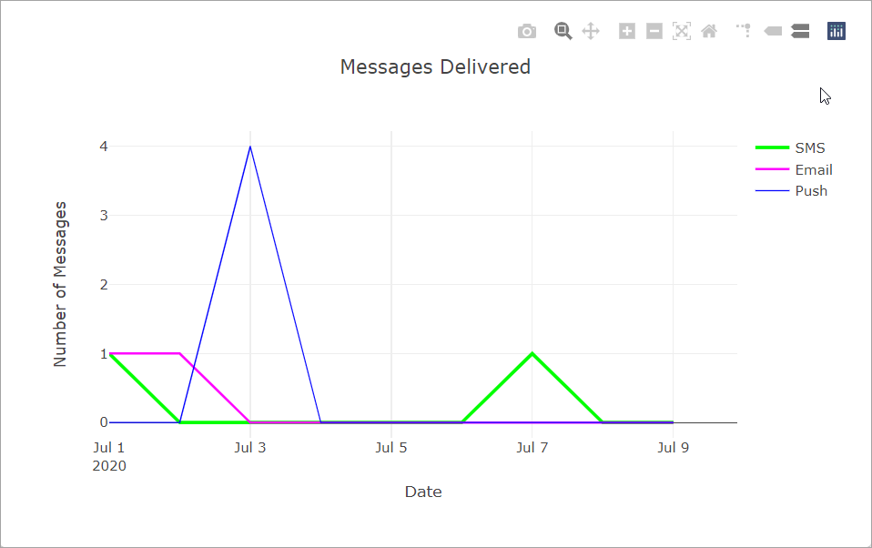
The x-axis will display the selected Date range and the y-axis will display the total Number of Messages sent.
Note
The data displayed in the Line Graph is for the selected timeframe in the Date Range filter.
Channel Distribution Pie Chart
In this Graph, it displays the percentage of Sent Messages by Delivery Channel: SMS, Email, and Push.
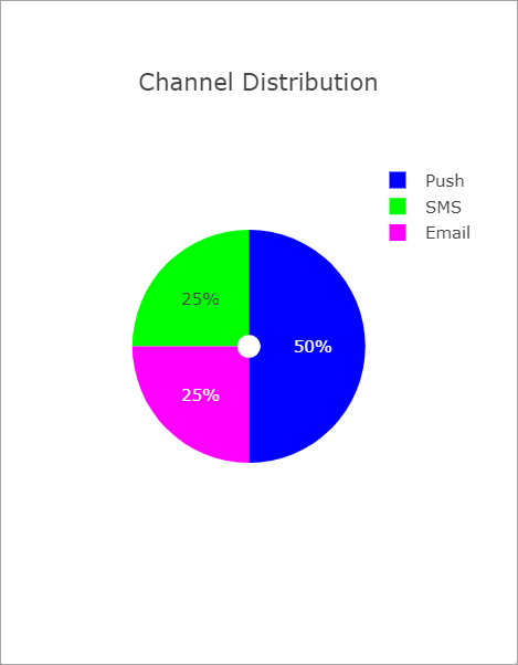
Note
The data displayed in the Pie Chart is for the selected time frame in the Date Range filter.